Almost everyone has experienced this moment: the wallpaper sample looks perfect. The colour, texture and overall character feel just right. Yet once it’s installed, the room looks different than expected.
This isn’t the result of a poor choice. It’s simply one of the fundamental principles of interior design: wallpaper never exists in isolation. Its true effect only emerges within the space around it.
1. Light Changes Colour—and Texture
Colours are never fixed. They respond to light, and every room has its own lighting conditions.
North-facing rooms receive cooler, more even daylight, while south-facing windows fill a space with warm, intense sunlight. Artificial lighting also plays an important role. Warm white creates a softer atmosphere, whereas neutral white reveals colours more clearly.
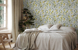
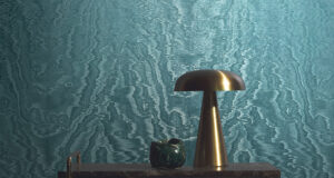
Textured wallpapers are particularly sensitive to these changes. Fine lines, textile-inspired surfaces and subtle variations in sheen transform as the light shifts throughout the day. A pattern that appears calm on a sample may suddenly come alive in raking light. Matte and shimmering finishes can create depth—or quietly recede into the background.
A sample viewed in a showroom is therefore only a snapshot. It is only in your own home that the wallpaper truly begins to interact with the light.
2. A Small Sample Doesn’t Tell the Whole Story
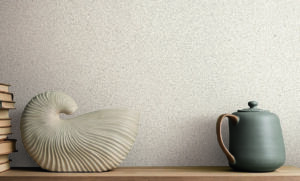
A 20 × 20 cm sample offers an impression—but not the experience of an entire room.
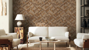
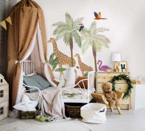
Scale amplifies every design decision. A subtle colour can become remarkably expressive across a large surface. A bold pattern may feel much more dominant when it covers several walls.
Proportion also matters. High ceilings benefit from vertical elements, while lower rooms often call for greater visual calm. Wall design influences our perception of width, height and depth far more than many pieces of furniture.
Wallpaper is not an accessory—it is part of the architecture.
3. Materials Are Always in Dialogue
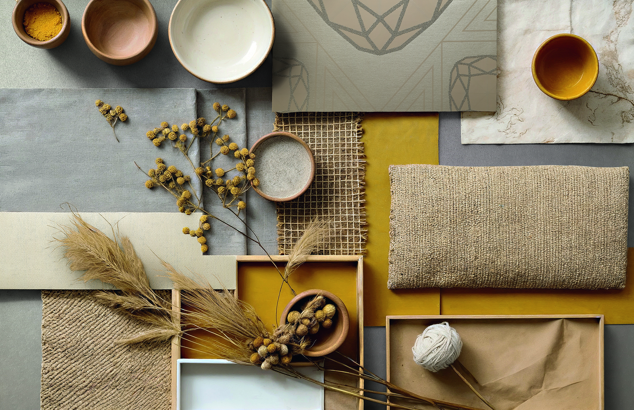
Wood, metal, glass and textiles all bring their own qualities to a space: colour temperature, texture and reflectivity.
Warm woods such as oak or walnut enhance the warm undertones of a wallpaper. Cooler materials like steel or concrete reinforce crisp, minimalist colour palettes. Textiles absorb light differently from smooth surfaces.
A wallpaper may blend harmoniously into its surroundings or deliberately create contrast—but it always responds to the materials around it. That is why its appearance changes as soon as it is viewed alongside the actual flooring, furnishings and lighting.
4. Perception Depends on Context
Our eyes never judge colour in isolation—they are constantly making comparisons.
A shade of green looks different beside beige than it does next to grey. A blue appears deeper against white, yet lighter when paired with dark wood.
Room size also influences perception. Strong colours tend to feel more immediate in smaller spaces, while in larger rooms they often reveal their depth with greater elegance.
Interior design is always about context.
5. Why Testing Isn’t a Sign of Uncertainty
Evaluating a wallpaper sample in your own home is not a sign of hesitation—it is a professional approach.
Architects and interior designers rarely make decisions without physical samples. They compare materials under real lighting conditions and assess how they interact with existing surfaces.
Because between a good idea and a successful interior lies one essential step: seeing it in its real environment.
Conclusion: Great Design Is Created Through Interaction
A wallpaper is defined by far more than its pattern. Its effect is shaped by light, scale, materials and context.
Those who consider these factors and test samples in their own space make more confident decisions—and create interiors that don’t just impress at first glance, but continue to feel right for years to come.