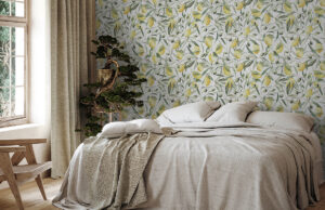
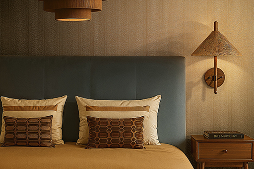
Gold has a bit of an image problem. Just a small one, perhaps. After all, when people think of golden walls, they often picture magnificent palaces, heavy curtains and furniture that looks as though it once belonged to Louis XIV. But gold can be very different: modern, understated and surprisingly relaxed. The key lies in the right combinations, intriguing surfaces and a sense of how much is just enough.
Gold Wallpaper: Less Opulence, More Personality
Gold is no longer reserved exclusively for classic, opulent interiors. In modern wall design, this warm metallic tone reveals its versatility. Sometimes it appears as a subtle shimmer on a textured surface, sometimes as an accent in a graphic pattern, and sometimes as a confident statement covering an entire wall. Things become particularly interesting when gold doesn’t shine uniformly but plays with matt areas, different textures and iridescent effects. The result is a surface that changes depending on how the light falls, giving the room a distinctive atmosphere.
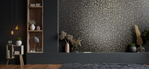
This interplay can be discovered in our GRAINS & PLAINS collection. Expressive textures meet carefully coordinated colour palettes and metallic accents. The designs featuring golden details in particular demonstrate just how contemporary this warm shade can look.
Which Colours Go Well with Gold?
Gold is surprisingly easy to combine with other colours. However, the effect depends on the atmosphere you want to create. For an elegant, modern look, pair gold with cool colours. Dark blue, petrol blue or anthracite provide an exciting contrast to the warmth of the metal. The result is expressive without feeling overwhelming. Soft grey and greige tones also harmonise beautifully with gold. They tone down its opulence and give the metallic sheen a more understated appearance.
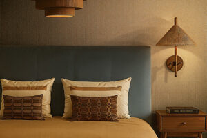
For a warmer look, choose burgundy, terracotta, blush pink or rich shades of brown. These combinations create a cosy atmosphere that works particularly well with natural materials such as wood, linen or leather. And then there’s the combination of gold and black – a classic that is hard to beat for elegance. However, the stronger the contrast, the more deliberately gold should be used.
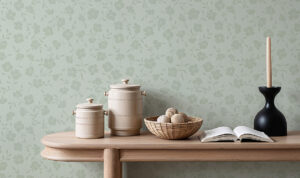
A beautiful example of how different colour families interact can be found in the PULSE colour palette from our GRAINS & PLAINS collection. Here, warm and cool shades come together, offering a wide range of possibilities for creative combinations.
Texture Instead of High Gloss: Gold You Can Feel
A golden wall doesn’t have to reflect like a mirror to make an impression. Quite the opposite: textured surfaces give metallic effects a particularly sophisticated character. Fine embossing, textile-like finishes and relief textures break up the light, allowing the gold tone to reveal different facets. Sometimes it stands out, sometimes it subtly recedes into the background. This gives the wall a lively appearance without the need for a bold pattern.
This combination of visual appeal and tactile quality also plays an important role in our GRAINS & PLAINS collection. The surfaces invite you to take a closer look and discover their intricate textures. Here, gold is not simply used as a colour but as a design element that interacts with light and materiality. Combined with understated furniture and natural fabrics, this creates interiors that feel sophisticated without demanding attention.
Golden Accents: How Much Is Just Right?
Does an entire room need to be covered in gold wallpaper? Of course not. Often, a single wall is enough to noticeably transform the atmosphere. In the bedroom, wallpaper with golden accents behind the bed can create an elegant focal point. In the living room, the wall behind the sofa is an ideal choice. And in the dining room, metallic surfaces can look particularly beautiful when combined with atmospheric lighting. What matters most is not the size of the surface but how well it fits into the overall interior concept.
A few design ideas can help you decide:
- Gold and wood: A warm combination that brings together natural beauty and elegance.
- Gold and dark colours: Ideal for expressive, contemporary interiors.
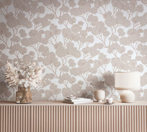
- Gold and light natural tones: A subtle interpretation of the metallic look.
- Gold and velvet: Particularly appealing for a luxurious yet inviting atmosphere.
- Gold and matt surfaces: The contrast makes the metallic shimmer even more interesting.
If you’re unsure which wallpaper to choose, it’s worth looking at different samples directly in the room. Metallic effects in particular can change significantly depending on daylight, artificial lighting and viewing angle.