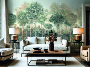
There was a time when walls had to do one thing above all else: stand out. Bold colours, striking patterns and strong contrasts were seen as expressions of individuality. If you wanted to make a statement, you did it with your walls. Today, we’re seeing a different trend. Interiors are becoming calmer. Materials are taking centre stage. Light, texture and tactile surfaces are taking on roles that were once reserved for colour alone. Quiet colours are making a comeback – and they feel more confident than ever.
Less Stimulation. More Space.
This isn’t about doing without. Quite the opposite. Neutral tones create a sense of openness. They allow furniture, artwork and materials to shine without disappearing into the background themselves. It is precisely their restraint that makes them so versatile. A warm beige, a soft cream or a subtle greige can transform the atmosphere of a room far more effectively than a bold accent colour. Not because these shades dominate the space, but because they bring everything together.
The Real Impact Lies in the Details
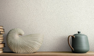
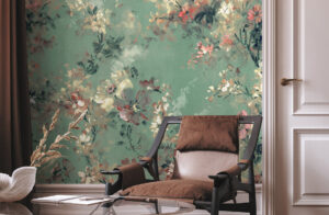
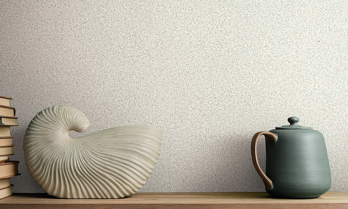
People often underestimate neutral colours because they only see them from a distance. Yet their true quality reveals itself on closer inspection. Delicate textile textures, matte finishes, subtle metallic highlights and gently textured surfaces give walls depth and character without demanding attention. This interplay is at the heart of the TEXTURES BOOK. In the chapter Neutral Walls, a wide variety of surface finishes demonstrates just how rich and expressive understated colours can be. One example is Vanilla Beige – a warm, light shade that interacts beautifully with light and reveals new nuances depending on the texture of the surface. The result is a remarkable sense of depth without the colour ever dominating the room.
Luxury Doesn’t Have to Shine
The term Quiet Luxury has shaped many areas in recent years, from fashion to interior design. It doesn’t describe lavish opulence, but rather a quality that speaks for itself. Premium materials, thoughtful details and timeless design. Neutral colours follow exactly the same principle. They don’t need to prove they’re contemporary. They feel just as relevant tomorrow as they do today, providing the perfect backdrop for furniture, architecture and natural light. That is precisely where their strength lies.
A New Understanding of Design
Perhaps the return of quiet colours also reflects something about the times we live in. Daily life has become faster. We’re constantly surrounded by information, screens compete for our attention and something always seems to be flashing somewhere. All the more reason why we long for spaces that offer the opposite: calm instead of sensory overload. Not sterile. Not boring. Simply restorative.
And Whatever Happened to Beige?
Finally, a small word in defence of beige. For many years, beige had the reputation of being the most boring colour of all—too safe, too understated, not daring enough. Today, those very same colour palettes go by names like Quiet Luxury, Soft Minimalism or Warm Neutrals and are celebrated as the epitome of timeless elegance. So perhaps beige never really had an image problem. Maybe it simply had a marketing problem. 😉