Colours shape a space long before furniture or decorative objects come into play. They provide orientation, create calm or tension, open up a room or make it feel more intimate. Many of our collections approach colour in exactly this way—not as decoration, but as the foundation of atmosphere. Colour names are not intended to define a fixed direction; instead, they evoke associations. They speak of light, landscapes, times of day and natural materials, leaving room for personal interpretation.
Warm Tones Inspired by Nature
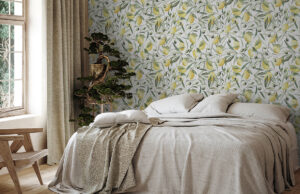
Colour becomes the starting point of an interior concept rather than its decoration. Warm shades of sand and stone evoke natural surfaces, earth, sunlight and mineral textures. They create interiors that feel open and tranquil without becoming cool or impersonal. These tones are particularly harmonious in light-filled spaces, where their warmth unfolds gradually throughout the day.
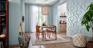
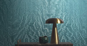
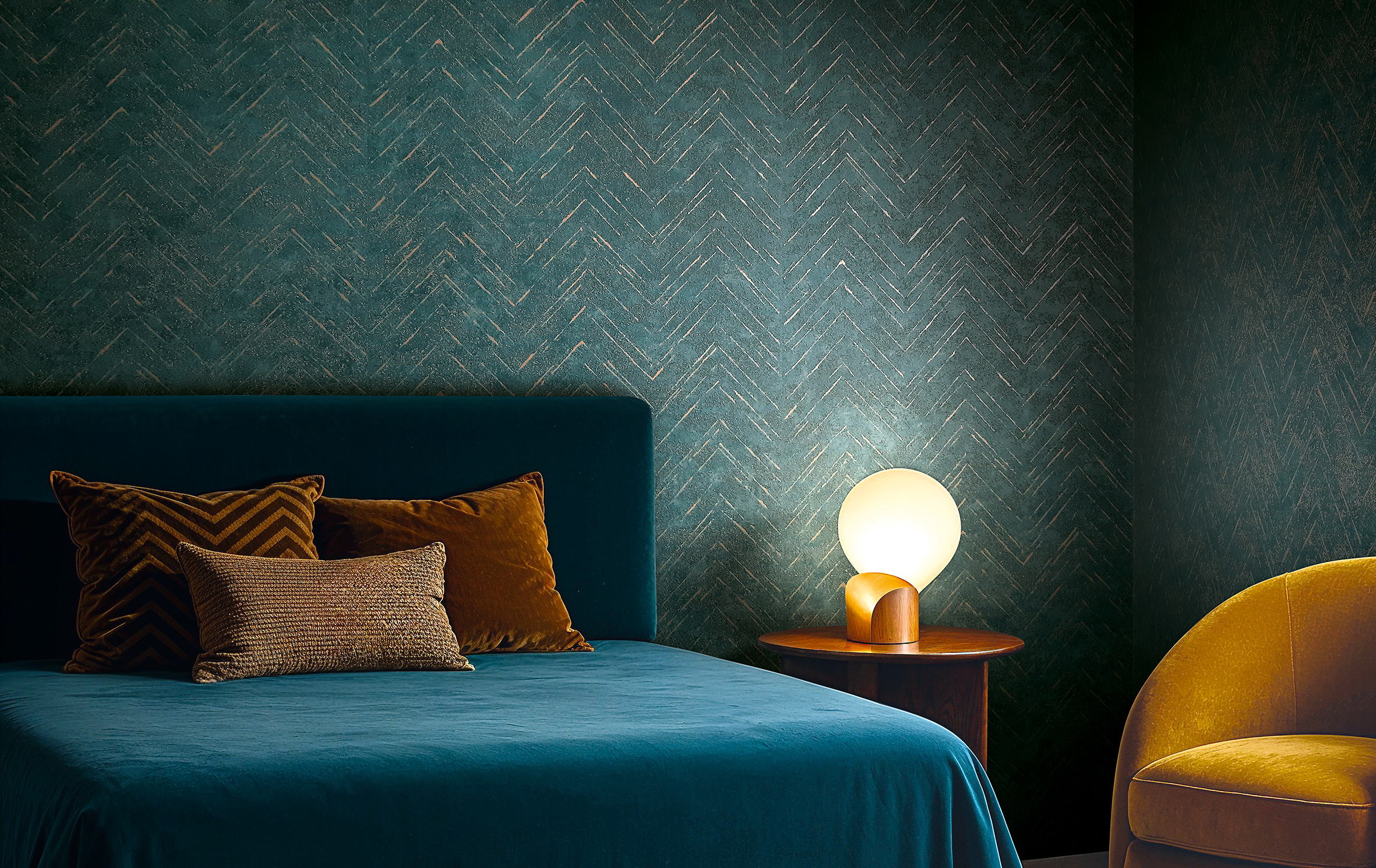
Another essential colour palette in contemporary interiors is built around muted greens and blues. These shades feel balanced and understated—almost quiet. They bring nature indoors without being literal, conveying a mood rather than an image. Depending on the changing light, they shift between depth and lightness, giving spaces a calm, focused atmosphere. They are especially well suited to areas designed for relaxation, such as living rooms, bedrooms or peaceful retreats.
Shades of Grey Create Clarity
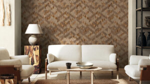
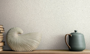
Soft ivory and subtle shades of grey add another dimension to the palette. They introduce clarity and structure without appearing harsh. These colours create balance, combine effortlessly with a wide range of materials and serve as a unifying element throughout the collection. Their understated character allows other materials—wood, textiles or ceramics — to take centre stage. Darker tones complete the spectrum. Deep stone and graphite shades create an enveloping sense of calm that feels almost protective. They give interiors presence and visual weight without making them feel heavy. Used across larger surfaces, they bring a remarkable sense of serenity while allowing architectural features to stand out more clearly. Texture subtly enhances the effect of colour. Fine grains, matte finishes and textile-inspired surfaces add depth and substance without overpowering the overall impression. The wall remains calm, yet never flat. Colour and material work together naturally, effortlessly and with lasting appeal.
Wallpapers That Create Atmosphere
Many of our wallpapers rely on the overall effect of the surface rather than on decorative motifs. This makes them exceptionally versatile and easy to combine—equally suitable for private homes, architectural projects and commercial interiors. They create spaces that feel authentic rather than staged, spaces that develop atmosphere instead of demanding attention.